VisiPal
A Chrome extension that helps visually impaired students explore the web with clarity, confidence, and ease.
Product Design

Project Overview
UW/UX Flow Designathon / First Place
Timeline: 7 hours (2025)
My Role: Product Ideation, Research, Product Designer
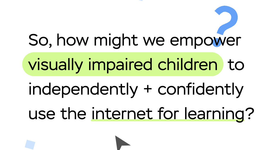
As the person in charge of product ideation, I chose to explore a Chrome extension because it improves an existing experience rather than creating a completely new one—it integrates seamlessly into how students already use the web. While researching accessibility tools, I noticed that many older reading aids lacked customization and didn’t support the specific needs of children with visual impairments. That insight shaped the direction of Visipal: a reimagined, customizable browsing companion designed to make online learning clearer, friendlier, and truly accessible.
User Persona
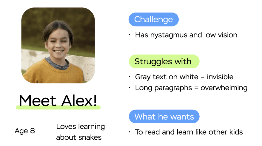
Alex is an energetic 8-year-old who’s endlessly curious—especially about snakes, animals, and anything he can read about online. But because he has nystagmus and low vision, the digital world isn’t always built for him. Subtle gray text disappears, long paragraphs blur together, and scrolling through dense pages quickly becomes exhausting.
At school, Alex often falls behind not because he lacks interest, but because the tools available don’t adapt to his specific visual needs. His teachers try their best, yet most reading extensions and accessibility features are one-size-fits-all, offering limited customization. At home, his parents want him to feel confident and independent online, but they constantly have to step in to help him navigate or decode webpages.
What Alex truly wants is the ability to read with ease, explore topics he loves, and learn at the same pace as his peers. He’s eager, motivated, and capable—he just needs a digital environment that meets him where he is.
Emphasis on Customization in Onboarding
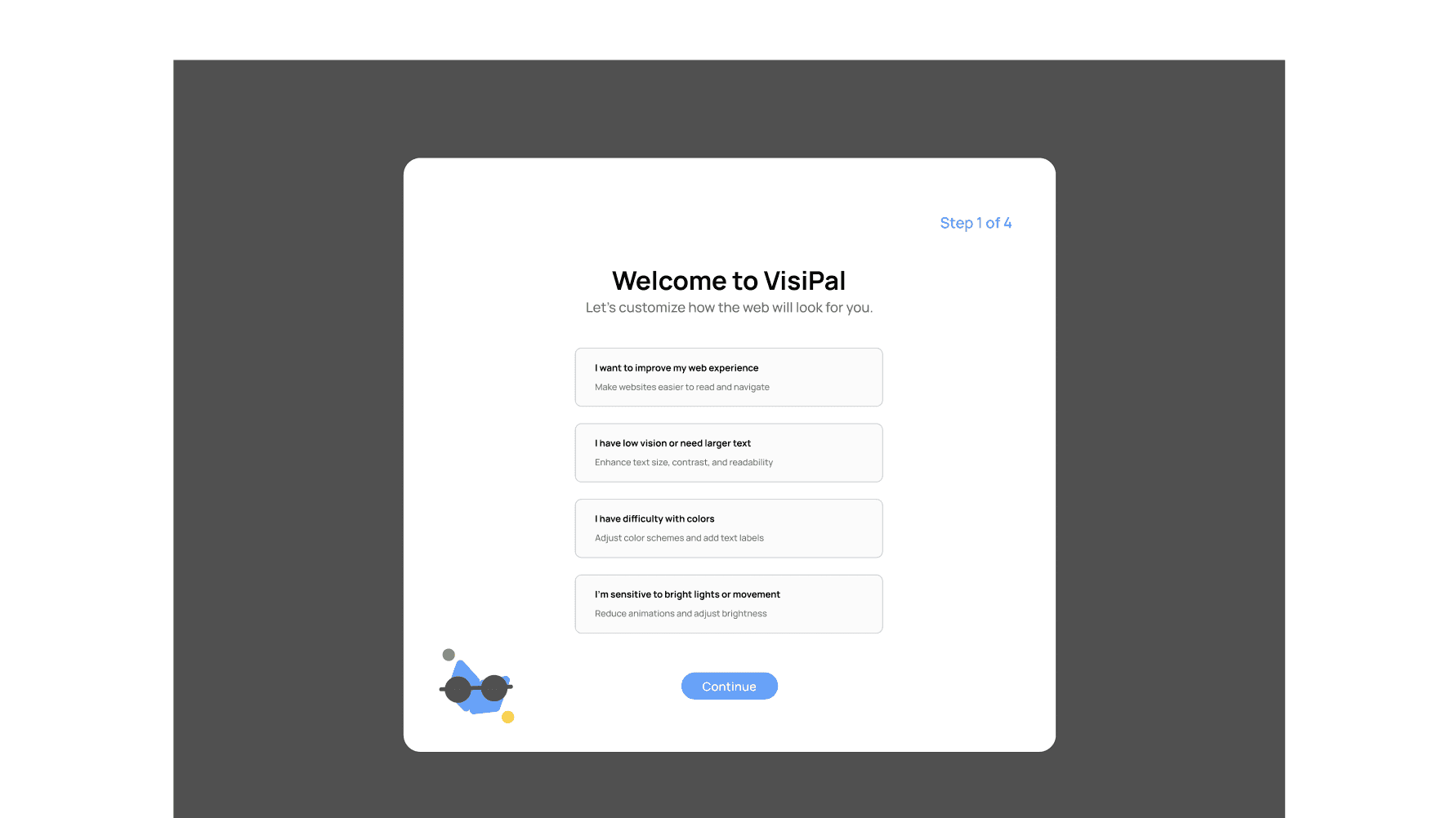
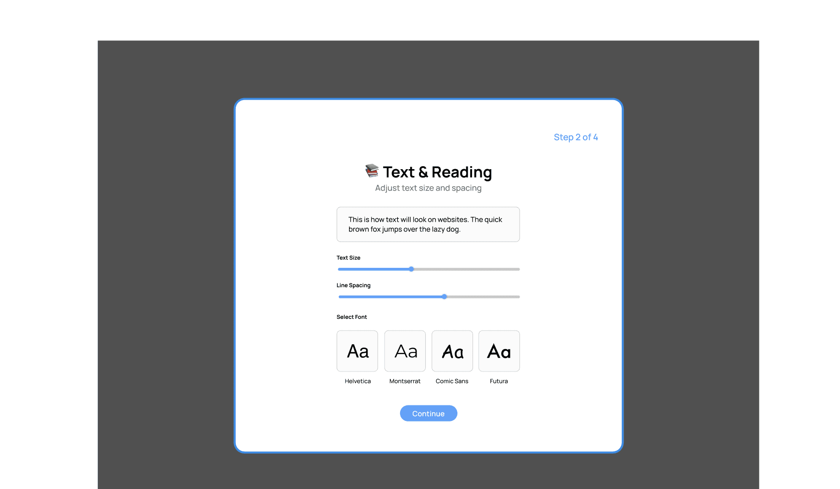
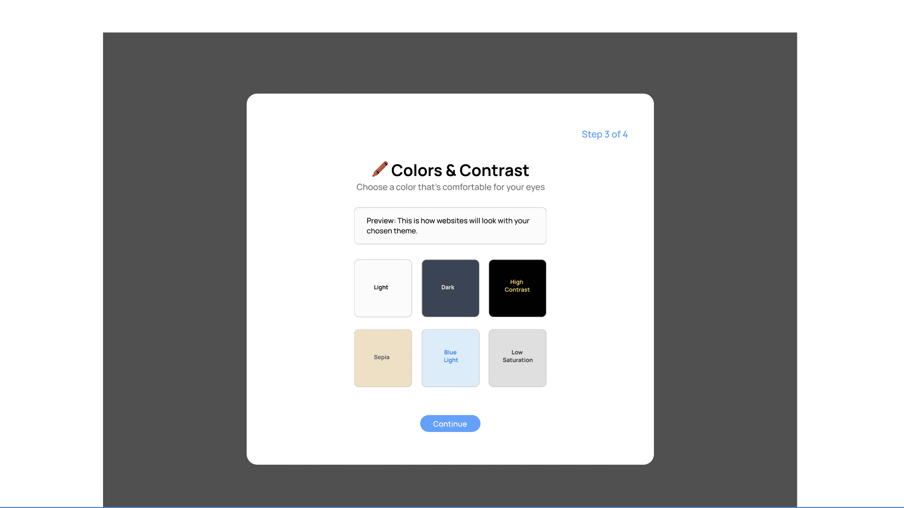
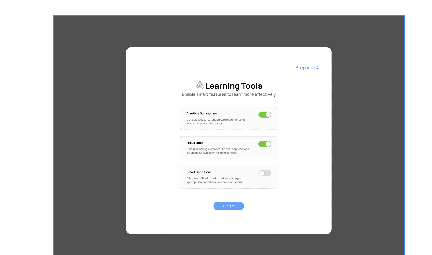
The onboarding flow helps each user personalize VisiPal to their specific visual needs in four simple steps. It begins by asking what kind of support they’re looking for—whether that’s larger text, better contrast, reduced brightness, or an overall easier reading experience. Next, users adjust text settings like font size, spacing, and type to match their comfort level. They then choose a color and contrast theme, previewing how websites will look with options like Dark, High Contrast, Sepia, or Low Saturation. Finally, users can enable smart learning tools such as AI summaries, Focus Mode, and click-to-define features to make reading and comprehension easier. By the end of onboarding, VisiPal is fully customized to each child’s unique needs, ensuring a more accessible and supportive web experience.
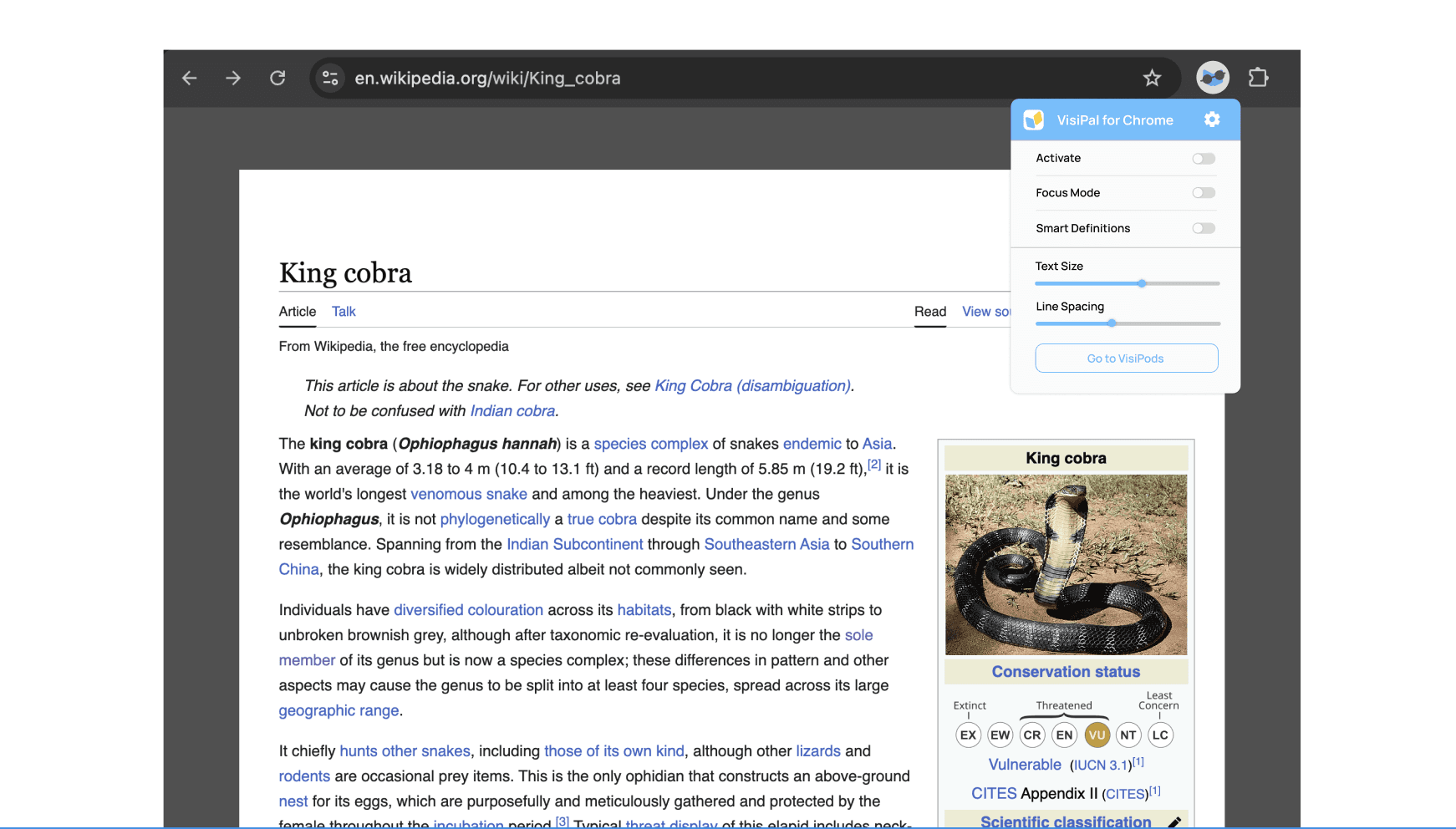
Before VisiPal
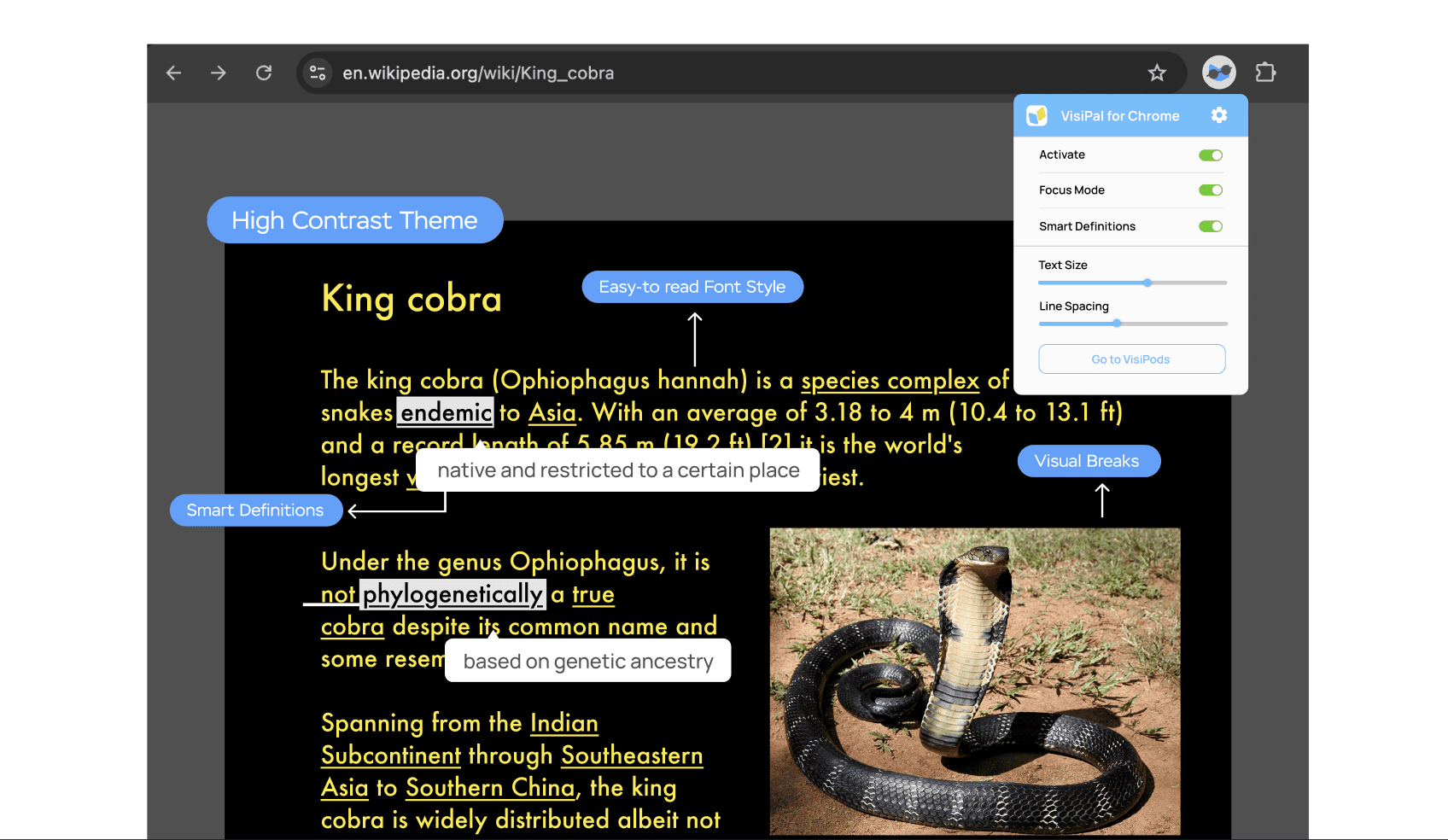
After VisiPal
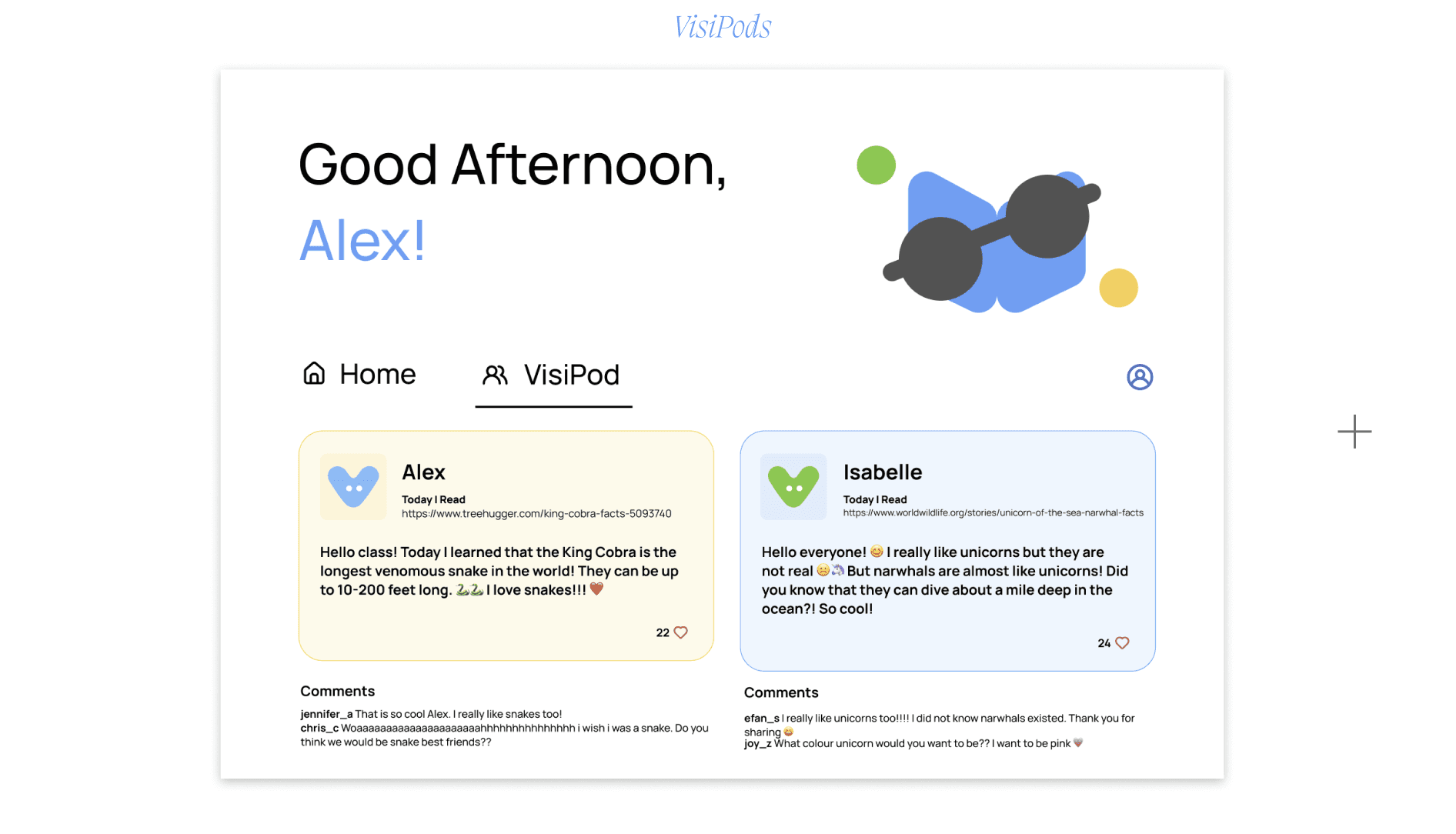
VisiPods
VisiPods is a shared learning hub where students can post what they’re discovering, celebrate their curiosity, and feel empowered by seeing how much they’re learning. It creates a supportive space where kids can explore together and take pride in the knowledge they’re gaining.
Lessons Learned
VisiPal showed me how meaningful it is to design for real, specific needs—especially for kids like Alex, who are curious, eager, and often overlooked in digital accessibility. By focusing on customization, clarity, and confidence, the project grew beyond a simple Chrome extension and became a way to help students feel seen, supported, and capable online. What stood out most was realizing how small, thoughtful design choices can transform a child’s learning journey. Ultimately, VisiPal is a reminder that empathetic, intentional design doesn’t just solve problems—it opens doors.